
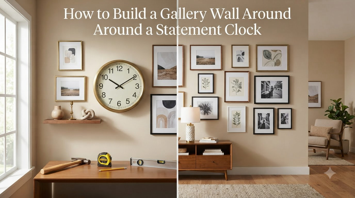
A statement clock does more than tell time. It commands attention, anchors a room, and gives your wall an instant personality upgrade. But surrounding that clock with the right mix of frames and art transforms a single piece into a full design moment.
That is exactly what a gallery wall around a statement clock achieves. You get the function of a timepiece and the warmth of a curated art display in one cohesive arrangement.
If you have been staring at an empty wall above your sofa or fireplace wondering what to do, this guide walks you through every decision. I will cover clock selection, layout planning, spacing rules, color coordination, and the mistakes that leave gallery walls looking random instead of intentional.
And yes, gallery walls are absolutely still in style in 2026. The trend has simply evolved from cluttered max-kitsch walls to more deliberate, balanced arrangements where a single statement piece anchors the composition.
Table of Contents
What Is a Gallery Wall Around a Statement Clock?
A gallery wall around a statement clock is a curated arrangement of framed art, photographs, and decorative elements built around a large wall clock that serves as the focal centerpiece. The clock acts as the anchor, and the surrounding frames create context, texture, and visual story.
Think of the clock as the lead actor and the frames as the supporting cast. Every piece plays a role, but nothing competes with the star.
This approach works for homeowners and renters alike. Anyone with a large empty wall above a sofa, fireplace mantle, bed, or dining console can benefit from it. The key is planning before you start hammering nails.
Step 1: Choose the Right Statement Clock
Before you arrange a single frame, you need the right clock. Most guides skip this step entirely, but clock selection determines everything that follows.
Your statement clock should fill roughly one-third to one-half of the total wall space you plan to use. A clock that is too small gets swallowed by surrounding frames. One that is too large leaves no breathing room for art.
For a standard living room wall measuring about 8 feet wide, look for a clock between 24 and 36 inches in diameter. Smaller walls call for 18 to 24 inch clocks, while expansive walls above 10 feet can handle clocks 36 inches or larger.
Consider the clock style too. A sleek modern clock pairs well with minimalist black-and-white photography. A rustic wooden clock loves botanical prints and warm-toned frames. A vintage-inspired clock works beautifully with sepia family photos and ornate gold frames.
The clock face color matters as well. A dark face creates dramatic contrast against light frames, while a light or white face blends more softly into the arrangement. Decide whether you want your clock to pop or to harmonize.
Step 2: Measure and Map Your Wall Space
This is where most people skip ahead and end up with a wall that feels off. Measuring and mapping your wall before buying or hanging anything saves hours of frustration.
Start by measuring the total width and height of your available wall space. Write these numbers down. Then decide how much of that space your gallery wall will occupy. A good rule is to leave at least 6 inches of clearance from adjacent furniture, ceilings, and door frames.
Now grab some kraft paper or newspaper. Trace the outline of each frame and your clock onto the paper, then cut them out. This is the paper cutout method that forum users and interior designers swear by.
Tape those paper cutouts to your wall using painter’s tape. Step back and look at the arrangement from across the room. This is your chance to experiment with layouts without putting a single hole in the wall.
Move pieces around until the arrangement feels balanced. Live with the paper version for a day or two if you can. You will quickly notice if something looks too heavy on one side or if a frame is too close to the clock.
Step 3: Decide Clock Placement (Centered vs Off-Center)
Your clock placement sets the tone for the entire arrangement. You have two main options, and each creates a distinctly different feel.
The Centered Clock
Centering the clock creates a formal, symmetrical look. The clock sits at the visual midpoint, and frames radiate outward in a roughly balanced pattern on both sides. This works well above fireplaces, beds, and dining room sideboards where symmetry feels natural.
Centered arrangements feel orderly and intentional. They are the safer choice if you want a polished, traditional aesthetic. Pair this with matching or coordinated frames for maximum formality.
The Off-Center Clock
Placing the clock off-center creates a more relaxed, modern feel. The clock might sit toward the upper left or lower right, with frames clustered around it in an organic flow rather than a mirror image.
This approach feels curated and personal rather than rigidly planned. It works beautifully in casual living rooms, entryways, and home offices. Off-center arrangements also give you more flexibility when working around light switches, vents, or windows.
Whichever you choose, hang the clock first. It is the heaviest visual element, and everything else should respond to its position.
Step 4: Plan Your Frame Arrangement (Grid vs Salon Style)
Once your clock placement is locked, the frame arrangement determines whether your gallery wall looks intentional or accidental. Two primary styles dominate, and understanding both helps you choose the right one for your space.
The Grid Layout
A grid arrangement uses matching frames in identical sizes arranged in clean rows and columns. Think four frames in a 2-by-2 square, or nine frames in a 3-by-3 grid. This style feels structured, modern, and gallery-like.
Grids work best with the same mat size and frame finish throughout. They pair naturally with centered clock placements and create a calm, organized energy. If you love order and minimalism, the grid is your friend.
The Salon Style Layout
The salon style mixes frame sizes, shapes, and finishes in a more organic cluster. A large piece might anchor one side while smaller frames fill gaps. This is the classic eclectic gallery wall look.
Salon arrangements feel collected over time, as if each piece was gathered on a different trip or inherited from a different family member. They pair beautifully with off-center clocks and in rooms where you want warmth and personality.
The secret to making salon style work is maintaining consistent spacing between every piece. Mixed sizes look intentional when the gaps are uniform. Random gaps make even beautiful art look haphazard.
The Hybrid Approach
You do not have to commit fully to one style. Some of the most striking gallery walls use a grid on one side of the clock and a looser salon cluster on the other. This creates visual interest while keeping the overall arrangement readable.
Step 5: Nail Your Spacing and Visual Balance
Spacing is the single most common reason gallery walls feel wrong. Forum users consistently report that their arrangements look off, and almost every time the culprit is inconsistent gaps between pieces.
Aim for 2 to 3 inches between every frame and between frames and the clock. This tight spacing creates visual cohesion, making separate pieces read as one unified composition rather than scattered decorations.
Wider spacing of 4 inches or more creates a more minimalist, airy look. This can work with fewer pieces, but it risks making the arrangement feel disconnected if you have many frames.
Use a consistent gap measurement throughout. Cut a small piece of cardboard to your chosen width and use it as a spacer between every piece as you hang. This guarantees uniform results without constant measuring.
Visual balance is about more than spacing. It is about distributing visual weight evenly. A large dark frame carries more visual weight than a small light one. If one side of your clock has a heavy dark frame, balance it on the opposite side with another substantial piece or a cluster of smaller frames.
The principle of odd numbers also helps. Interior designers frequently mention that three is the magic number for groupings. Odd-numbered clusters feel more natural and dynamic than even-numbered ones, which can look overly rigid.
Step 6: Coordinate Colors and Art Styles
Color coordination is what separates a professional-looking gallery wall from a random assortment. You do not need everything to match, but you do need a thread that ties the pieces together.
Start with your clock as the color anchor. Pull one or two colors from the clock face, rim, or numerals and repeat them in your artwork or frames. If your clock has a brass rim, echo that warmth with gold frames or artwork featuring amber tones.
Frame finishes should either match intentionally or mix deliberately. Three or four frames in the same finish creates a coordinated look. Mixing black, wood, and gold frames can work if the art inside shares a consistent color palette.
When clock and art colors clash, the fix is simpler than you might think. Add a neutral buffer. A white-matted black-and-white photograph between two clashing pieces absorbs the tension and lets each element breathe.
Art style mixing is where personality shines. Pairing a vintage botanical print with a modern abstract piece and a family photo creates depth and story. The unifying factor should be color palette or frame style, not subject matter.
Limit your color palette to three or four dominant colors across the entire arrangement. More than that risks visual chaos. When in doubt, black, white, and one accent color is a combination that never fails.
Room-by-Room Placement Guide
Different rooms call for different approaches. Here is how to adapt your gallery wall around a statement clock for each space in your home.
Living Room
The wall above the sofa is the most popular spot for a statement clock gallery wall. Center the clock at about 60 to 66 inches from the floor to its midpoint, which is eye level for most people when seated. Build frames outward from there, keeping the lowest frame at least 6 to 8 inches above the sofa back.
Above the Fireplace
A fireplace mantle naturally draws the eye, making it an ideal location. Center the clock above the mantle and flank it with frames that step down in size toward the edges. This creates a pyramid effect that feels stable and grand.
Bedroom
Above the bed, keep the arrangement calming rather than busy. Use softer art, lighter frames, and fewer pieces. The clock should be visible from your pillow without being so large it feels oppressive. A 24-inch clock with four to six frames works well for most bedrooms.
Dining Room
Dining rooms benefit from conversation-starting arrangements. This is the place for bold art, travel photos, or family portraits. Position the clock at standing eye level since people interact with this wall while seated at the table and while serving.
Entryway
Entryway gallery walls set the tone for your entire home. A statement clock here is both decorative and functional, greeting guests with the time. Keep the arrangement relatively compact so it does not overwhelm a narrow hallway.
Home Office
In a home office, the clock serves double duty as decor and time management. Surround it with motivational art, certificates, or pieces that inspire focus. Keep the color palette clean to avoid distraction while working.
Common Mistakes to Avoid
After reviewing forum discussions and design resources, several mistakes come up repeatedly. Avoiding these will save your gallery wall from looking amateur.
Inconsistent spacing is the number one offender. Mixed gaps between frames instantly make an arrangement look unplanned. Use that cardboard spacer for every single piece.
Choosing a clock that is too small for the wall is equally common. A 12-inch clock on a 10-foot wall disappears. When in doubt, go bigger with your statement piece.
Hanging frames too high is a mistake many people make. The center of your arrangement should sit at eye level, around 57 to 60 inches from the floor. Hanging everything higher makes the wall feel disconnected from the room.
Ignoring visual weight leaves one side of the clock visually heavier than the other. Step back frequently during the hanging process and check for balance.
Using too many colors without a unifying palette creates chaos. Pick three or four dominant tones and stick with them across all frames and art.
Skipping the paper planning step leads to extra nail holes and frustration. Those paper cutouts take thirty minutes to make and save you from costly mistakes.
Renter-Friendly and Budget Tips
You do not need to own your home or spend a fortune to build a stunning gallery wall around a statement clock. Damage-free solutions have come a long way.
Command strips and similar adhesive hooks can hold surprisingly heavy frames when used correctly. Check the weight rating on each strip and use more than you think you need. For lighter frames and the clock itself, velcro-style picture hanging strips provide a secure hold without marring walls.
For budget-friendly frames, thrift stores and discount retailers offer frames that look expensive with a coat of spray paint. Unified spray-painted frames in the same finish make mismatched thrift finds look like a coordinated set.
Print your own art for free from public domain collections, or use family photos printed at your local drugstore. The most meaningful gallery walls are often the least expensive ones because they tell your personal story.
Start small if budget is tight. Begin with the clock and three frames, then add pieces over months or years as you find them. A gallery wall that grows organically often feels more authentic than one assembled all at once.
FAQs
How to decorate a wall around a clock?
Start by hanging the clock at eye level, then surround it with framed art and photos spaced 2 to 3 inches apart. Use a paper cutout method to plan the layout on the wall before hammering nails. Distribute visual weight evenly on both sides of the clock for a balanced look.
Are gallery walls out of style?
No, gallery walls remain popular, but the trend has shifted toward more deliberate, balanced arrangements. Instead of cluttered max-kitsch walls, today’s gallery walls use intentional spacing, coordinated color palettes, and a single anchor piece like a statement clock to create a curated feel.
What are common gallery wall mistakes?
The most common mistakes are inconsistent spacing between frames, choosing a clock that is too small for the wall, hanging everything too high, ignoring visual balance, using too many colors without a unifying palette, and skipping the paper layout planning step before hammering nails.
How to create a simple gallery wall?
Start with your statement clock centered on the wall at eye level. Add three to five frames in a tight cluster with 2 to 3 inches of spacing between each piece. Use matching frames and a limited color palette of three to four tones to keep the arrangement clean and cohesive.
Are oversized wall clocks still in style?
Yes, oversized wall clocks are still very much in style. They serve as functional art and natural focal points, especially when surrounded by a gallery wall. The key is choosing a size proportional to your wall, roughly one-third to one-half of the total wall space you plan to use.
Where is the best place to put a clock in the living room?
The best placement is typically above the sofa, centered on the wall, at 60 to 66 inches from the floor to the clock’s midpoint. Other strong locations include above the fireplace mantle or on a large empty wall visible from the main seating area. Avoid placing clocks in direct sunlight, which can damage the mechanism.
What to put on a wall with a clock?
Surround the clock with framed art, family photographs, botanical prints, travel souvenirs, or mixed media pieces. Choose artwork that shares a color palette with the clock and limit yourself to three or four dominant colors. The clock should remain the focal point while the surrounding pieces add texture and personal story.
What to put on either side of a wall clock?
Place frames of similar visual weight on each side of the clock to create balance. On a centered clock, use symmetric or near-symmetric groupings. For an off-center clock, use a larger cluster of smaller frames on the open side to balance the clock’s visual weight. Maintain consistent 2 to 3 inch spacing throughout.
Wrapping Up Your Statement Clock Gallery Wall
Building a gallery wall around a statement clock comes down to six clear steps. Choose the right clock size, map your wall with paper cutouts, decide on centered or off-center placement, pick a grid or salon arrangement, maintain consistent 2 to 3 inch spacing, and coordinate your colors across every piece.
The result is a wall that looks intentional, personal, and professionally designed. Your statement clock becomes the anchor of a composition that tells your story rather than just filling empty space.
Start with the planning phase, live with your paper layout for a day, and take your time hanging each piece. The most beautiful gallery walls around a statement clock are built with patience, not speed.