
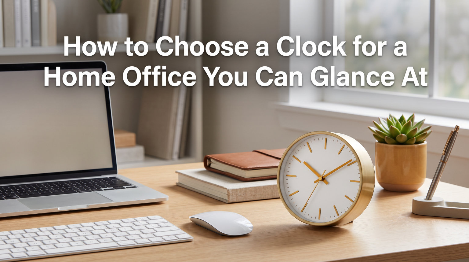
Learning how to choose a clock for a home office you can glance at comes down to one simple idea: you should know the time in under a second without breaking your concentration. Most remote workers reach for their phone fifty or more times a day just to check the time, and each glance pulls you into notifications, messages, and distractions that derail your focus.
A well-chosen clock fixes that problem. The right one sits in your peripheral vision, delivers the time instantly, and disappears back into the background until you need it again. In this guide, I will walk you through every factor that makes a clock truly glanceable, from numeral size and contrast to silent operation and strategic placement.
Whether you are setting up a new home office or upgrading a workspace you have used for years, the principles here will help you pick a timepiece that supports your productivity rather than fighting against it.
Table of Contents
Why Glanceability Matters in a Home Office Clock
Glanceability is the ability to read something in a fraction of a second without shifting your full attention to it. Think about how you read a speedometer while driving. Your eyes flick to it, register the number, and return to the road almost instantly. That is glanceability in action.
A clock with strong glanceability works the same way in your home office. You check the time mid-task, absorb the information, and keep working without losing your train of thought. This matters more than most people realize.
Research on attention switching shows that every interruption, even a brief one, costs you up to 23 minutes to fully refocus. When you pick up your phone to check the time and see a notification, that quick glance can spiral into a 10-minute detour through email and social media. A dedicated clock eliminates that trap entirely.
No competitor guide I found while researching this topic treats glanceability as the primary selection criterion. Most focus on style or features. But if your goal is a clock you can actually glance at while working, glanceability should drive every decision you make.
How to Choose a Clock for a Home Office You Can Glance At
Choosing a clock for a home office you can glance at means evaluating four core factors: readability, size, movement type, and placement. Each one contributes to how quickly and effortlessly you can check the time. Let me break down what to look for in each category.
Prioritize Large, Clear Numerals or Digits
The single most important factor in glanceability is the size of the numbers on the clock face. Small numerals force your eyes to focus and refocus, which takes longer and strains your vision. Large numerals let your peripheral vision do most of the work.
For analog clocks, look for numerals that are at least one inch tall on a standard 12-inch clock. Arabic numerals (1, 2, 3) are generally easier to read quickly than Roman numerals because your brain processes them faster. Bold, thick numerals outperform thin, elegant ones when speed matters.
For digital clocks, the digits should be tall enough to read from your seated position without squinting. LED displays with digits at least 1.5 inches tall work well for most desk-to-eye distances. Avoid clocks with tiny secondary displays for dates or temperatures if they crowd the main time readout.
Look for High Contrast Between Face and Markers
Contrast is what makes a clock readable in different lighting conditions throughout the day. A white face with black numerals offers the highest contrast and the fastest read time. A dark face with dark numerals might look sleek, but it forces your eyes to work harder.
The same principle applies to analog clock hands. Bold, dark hands against a light face are easier to track at a glance than thin, metallic hands that blend into the background. If you choose a clock with a dark face, make sure the numerals and hands are in a light, contrasting color.
I tested several clocks in my own office at different times of day, and the high-contrast models were readable even in late afternoon glare. The low-contrast ones became nearly invisible when sunlight hit them at an angle.
Match Size to Your Viewing Distance
Clock size should scale with how far away you sit from it. A general rule: the clock’s diameter in inches should be roughly one-tenth of your viewing distance in inches. If your desk is 60 inches from the wall, a 6-inch clock is the minimum size for comfortable glancing.
For a clock across the room, you need something larger. A 12 to 14-inch wall clock works well for distances up to about 12 feet. Beyond that, look for clocks in the 15 to 18-inch range. Anything smaller becomes a blur when you try to read it from across the room.
Desk clocks work differently because you are closer to them. A 4 to 6-inch desk clock is readable from arm’s length. Just make sure the numerals are proportional to the face so they do not shrink as the clock gets smaller.
Choose Between Analog and Digital
Both analog and digital clocks can be glanceable, but they read differently. Digital clocks give you an exact time instantly, which is ideal when you need precision for meetings or deadlines. Analog clocks show time as a spatial relationship, which some people process faster for relative time awareness.
Digital clocks win for speed when you need to know it is exactly 2:47. Analog clocks win when you need to sense how much time has passed or how much remains in your work block. Many home office workers find an analog clock better for managing flow because it shows time as a visual chunk rather than an abstract number.
Your choice also affects your workspace aesthetic. Digital clocks lean modern and functional. Analog clocks offer more design variety and tend to look more professional on video calls.
Silent Operation: The Hidden Productivity Factor
A ticking clock might seem harmless, but in a quiet home office, that sound becomes a constant background intrusion. Forum discussions on Reddit’s home office and digital minimalism communities consistently rank ticking as one of the most annoying features of cheap clocks. One user described it as “a slow drip that erodes your sanity during deep work sessions.”
The problem is not just annoyance. Studies on workplace noise show that intermittent sounds, even quiet ones, trigger micro-interruptions in concentration. A clock that ticks once per second creates 60 micro-interruptions per minute, 3,600 per hour. Over an eight-hour workday, that is nearly 29,000 tiny disruptions to your focus.
Silent Sweep vs Ticking Movements
Silent sweep movement is the solution. Unlike traditional quartz movements that jump the second hand forward once per second with an audible tick, a silent sweep movement moves the second hand in a continuous, smooth motion that produces no sound.
This technology uses a different gear mechanism that eliminates the stop-start motion responsible for the ticking noise. The second hand glides around the dial silently, and you get the same accurate timekeeping without the constant auditory distraction.
If you do any kind of focused work such as writing, coding, design, or deep reading, a silent sweep clock is non-negotiable. The difference in your ability to concentrate is immediate and noticeable.
Quartz vs Mechanical Movements Explained
Quartz movements are battery-powered and use a small crystal oscillator to keep time accurately. They are reliable, affordable, and require minimal maintenance. Most silent sweep clocks on the market use quartz technology. Battery life typically ranges from 8 to 14 months depending on the clock size.
Mechanical movements are powered by a mainspring that you wind manually or automatically. They are prized by collectors for their craftsmanship and smooth sweeping seconds hand. However, mechanical clocks require regular winding, cost significantly more, and may gain or lose a few seconds per day.
For a home office where reliability and silence matter most, quartz with silent sweep is the practical choice. Mechanical clocks are beautiful but demand more attention than a productivity tool should.
Size and Placement for Maximum Glanceability
Where you put your clock matters as much as which clock you buy. Even the most readable clock in the world becomes useless if it is positioned where you have to turn your head or refocus your eyes to see it. The goal is placement that lets you check the time with minimal eye movement and zero head movement.
Wall Clock vs Desk Clock: Which Works Better
Wall clocks and desk clocks each have distinct advantages for a home office. A wall clock placed directly in your line of sight lets you check the time without looking away from your monitor. It keeps your desk surface clear and works well for larger offices where you move around during the day.
A desk clock sits within arm’s reach and works well for closer viewing. It is easier to reposition, and some models include useful extras like temperature displays or alarms. The downside is that it occupies desk real estate and may require you to shift your gaze downward.
Many home office workers use both. A wall clock handles quick glances during focused work, while a desk clock manages alarms, timers, and Pomodoro sessions. If you choose only one, think about where your eyes naturally rest during the day.
Best Placement Positions for Your Clock
The ideal clock position is in your upper peripheral vision, slightly above eye level and within a 30-degree arc of your primary screen. This lets you register the time without moving your head at all. Your eyes shift, absorb the time, and return to your work in under a second.
If you use a wall clock, mount it on the wall behind or beside your monitor at roughly the same height as the top of your screen. Avoid placing it behind you, which forces you to turn around completely. Also avoid positions where window glare will wash out the face during certain hours.
For a desk clock, place it at the edge of your desk closest to your dominant eye. If your monitor sits straight ahead, position the clock at an angle where a quick glance to the side picks it up. Keep it far enough away that the numerals are readable without crossing your eyes.
Style That Works on Video Calls
Your home office clock is visible to colleagues and clients during video calls, which makes it part of your professional presentation. A clock that looks cheap, cluttered, or distracting in the background can subtly undermine the impression you make. On the other hand, a clean, well-designed clock adds a touch of intentionality to your space.
For video calls, minimalist clocks perform best. Clean faces with simple numerals, neutral colors, and uncluttered designs read well on camera. Avoid clocks with lots of secondary displays, flashing lights, or busy decorative elements that compete for attention.
Consider how the clock looks in your camera frame. If it sits in the background, it should complement your decor without drawing the eye away from you. Metallic finishes, matte black, and white faces photograph well and pair with most office color schemes. Wooden clocks add warmth to spaces that feel sterile on camera.
I have been on calls where someone’s bright red digital clock flashed the time constantly behind their head. It was hard to focus on what they were saying. Your clock should be felt, not noticed, on video just as it should be during focused work.
Reducing Eye Strain with the Right Clock
No competitor guide I found addresses eye strain, but it is a real concern for anyone who spends hours looking at screens. Every time you check your phone for the time, your eyes shift from your monitor distance to a close-up focal distance. That constant refocusing contributes to digital eye strain, which affects about 60% of remote workers.
A well-placed clock reduces this strain because it sits at roughly the same focal distance as your monitor. When you glance at a wall clock that is a few feet behind your screen, your eyes barely adjust. When you look at a desk clock at monitor distance, there is almost no focal shift at all.
Contrast also plays a role in eye comfort. High-contrast clocks are easy to read without straining, while low-contrast ones force your eyes to work harder in dim conditions. If your office lighting changes throughout the day, choose a clock that remains readable in both bright and soft light.
For evening or early morning work, avoid clocks with harsh backlighting that creates glare. LED clocks with auto-dimming features adjust their brightness based on ambient light, which protects your eyes during low-light sessions. Analog clocks with luminous hands offer a gentler option for nighttime visibility.
Using Clock Placement to Set Work-Life Boundaries
One of the biggest challenges of working from home is knowing when to stop. Without the physical cues of an office environment, work bleeds into personal time. Your clock can help enforce boundaries if you use it intentionally.
Place a clock where you can see your end-of-day target clearly. When you hit your scheduled stop time, the clock becomes your accountability partner. Some remote workers set a specific clock position to represent quitting time and train themselves to respect it.
You can also use a clock to structure your day into visible blocks. Seeing the hands move through your work periods creates a physical sense of time passing that a phone notification cannot replicate. This spatial awareness of time helps you wrap up tasks naturally rather than working until exhaustion.
Common Mistakes to Avoid When Choosing an Office Clock
After researching forums, reviewing competitor guides, and testing clocks in my own workspace, I identified the most common mistakes people make when choosing a clock for their home office.
1. Choosing style over readability. A beautiful clock you cannot read is just wall art. Always prioritize numeral size and contrast before aesthetics. You can find attractive clocks that are also highly readable.
2. Buying a ticking clock for a quiet space. That gentle tick in the store becomes maddening after a week of silent home office work. Always confirm the clock has a silent sweep movement before buying.
3. Going too small. Small clocks force you to squint and lean in, which breaks your focus. Size up rather than down. You can always find a larger clock that fits your space.
4. Placing the clock behind you. A clock behind your desk forces you to turn around every time you want the time, which fully interrupts whatever you were doing. Position it in front of you or to the side.
5. Choosing low contrast for the sake of design. Dark-on-dark or metallic-on-metallic faces look sleek but become unreadable in certain lighting. Stick with proven high-contrast combinations.
6. Forgetting about video calls. A clock that flashes, ticks loudly enough for the microphone to pick up, or looks unprofessional can undermine your presence on calls. Test how it looks and sounds on camera.
7. Relying on cheap clocks that lose time. Forum users frequently report budget clocks losing several minutes within weeks. Accuracy matters when you are managing meetings and deadlines. Invest in a clock from a reputable manufacturer.
FAQs
Where is the best place to put a clock in an office?
The best place for an office clock is in your upper peripheral vision, slightly above eye level and within a 30-degree arc of your primary monitor. This position lets you check the time without moving your head, preserving your focus. For wall clocks, mount it behind or beside your screen at roughly the same height as the top of your monitor. Avoid placing clocks behind you or in spots where window glare washes out the face.
Which clock is good for office?
A good office clock has large high-contrast numerals, a silent sweep quartz movement, and a size that matches your viewing distance. Analog clocks with bold hands on a white face work well for most offices. Digital LED clocks with large displays are ideal if you need precise time for meetings. The clock should be readable at a glance without requiring you to refocus your eyes.
What are the features of a clock?
Key clock features to look for include large readable numerals or digits, high contrast between the face and markers, a silent sweep movement to avoid ticking, accurate quartz timekeeping, appropriate size for your viewing distance, and a design that fits your office aesthetic. Additional features like auto-dimming, temperature display, and dual time zones can be useful but should not compromise basic readability.
How to choose the right large clock for your home?
Choose a large clock by matching its diameter to your viewing distance at a ratio of roughly 1 inch per 10 inches of distance. For a wall 12 feet away, a 14 to 16-inch clock works well. Prioritize high-contrast numerals, silent operation, and a clean design that complements your decor. Avoid overly decorative faces that reduce readability at a distance.
Conclusion
Knowing how to choose a clock for a home office you can glance at comes down to prioritizing readability, silence, and strategic placement over everything else. Large high-contrast numerals let your peripheral vision do the work. Silent sweep quartz movement eliminates the micro-interruptions that erode focus. And positioning the clock in your upper peripheral vision keeps time checks effortless.
Start by measuring the distance from your desk to where your clock will sit, then choose a size and style that matches. Confirm the movement is silent sweep, verify the contrast works in your lighting, and test how the clock looks on video calls. The right clock fades into your workspace and supports your productivity without ever demanding your full attention.