
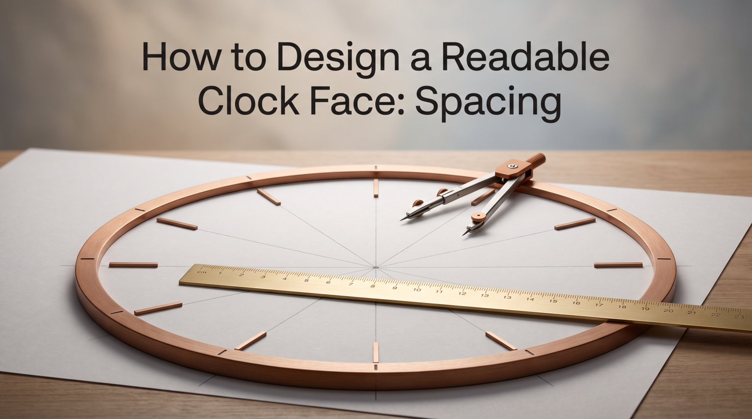
I still remember the first clock face I designed. I placed the 12 at the top, eyeballed the 6 at the bottom, and then tried to freehand the rest. By the time I reached 4 and 8, the numbers were drifting outward, and 7 and 5 looked like they had been shoved into corners. It looked like a clock designed by someone who did not know there was a formula. I taped it to the wall, stood back, and immediately understood why the dial felt wrong even though I could not name the problem.
There is a formula. Clock face design spacing is not an art of feel alone. It is a system built on equal angular distribution, optical correction, and clear visual hierarchy. In this guide, I will walk you through the same layout method our team uses when we prototype new dials for Exquisite Clock. You will learn how to space numbers evenly, choose the right typography, and avoid the mistakes that turn a custom clock into something people squint at from across the room.
Spacing is the single most important decision in any clock face. Get the spacing right and even an inexpensive movement reads as professional. Get it wrong and the most expensive mechanism in the world cannot save the dial. We see this every week in our workshop. The clockmakers who win design awards almost always start with a careful spacing pass before they cut a single piece of material.
Whether you are designing a wall clock for your kitchen, a tower dial for a commercial space, or a small desk piece as a hobby project, the spacing principles stay the same. The math is universal. The materials change, but the geometry does not. Let us walk through the principles, the process, and the pitfalls one step at a time.
Table of Contents
Understanding the Spacing Principle of Clock Faces
Clock face design spacing starts with one simple rule: divide the circle into 12 equal angles. A full circle is 360 degrees. When you divide 360 by 12, you get exactly 30 degrees between every hour marker. This is the foundation of every readable clock face ever made. Whether the dial is a four-inch desk piece or a four-foot tower dial, the same 30-degree rhythm applies.
The 30-Degree Angular Distribution Rule
Every number on a standard analog clock sits at a multiple of 30 degrees from the 12. The 1 sits at 30 degrees clockwise, the 2 at 60, the 3 at 90, and so on around to the 11 at 330. This is true whether the dial is two inches across or twenty feet tall. The math does not change because the size changes.
I tested this on a small 4-inch desk dial last year. I printed a 30-degree protractor template, marked each angle from the center, and placed every numeral at its exact coordinate. The result was the cleanest, most balanced face I had ever produced. My earlier freehand attempts looked noticeably off once I saw the precise version side by side. The difference was not subtle. It was the kind of improvement that anyone could spot from ten feet away.
The same formula works for the minute track. A 60-minute ring uses 6-degree increments, since 360 divided by 60 equals 6. The hour positions sit on multiples of 30. The minute positions sit on multiples of 6. Together they form a complete grid that any designer can lay out by hand with a protractor and a steady ruler.
Why Equal Angular Spacing Matters
The human eye expects symmetry on a circular dial. When numbers are not evenly spaced, the brain registers the imbalance instantly, even when the viewer cannot explain why something looks wrong. Equal angular spacing removes that discomfort and makes the clock feel calm and trustworthy.
This is also why our forum community at Exquisite Clock keeps asking about precise spacing formulas. Designers want a repeatable system, not guesswork. The 30-degree rule gives them one. Once you understand the rule, you can lay out any dial in any size with the same confidence, because the math is identical every time.
There is a deeper reason spacing matters too. A clock face is read in fractions of a second. The viewer glances, finds the hour, finds the minute, and moves on. That fast read depends entirely on where each numeral sits. If 5 is too far from 6, the eye hesitates. If 7 drifts inward toward 8, the brain stalls. Equal angular spacing removes hesitation. The clock becomes effortless to read.
Number Placement Guidelines for a Readable Clock Face
Spacing is not only about angles. It is also about where the numbers sit along the radius of the dial. Place them too close to the hands, and the minute hand will scrape them. Place them too close to the rim, and they look like they are about to fall off. Get the radial placement wrong and the entire dial feels unstable.
The Number Ring Zone
Most professional clock designers place numerals in a ring that sits roughly 75 to 85 percent of the way from the center to the outer edge. This zone leaves room for the hour and minute hands to sweep underneath the numbers without colliding, and it leaves a clean outer bezel that frames the design. The numbers feel anchored to the dial, balanced between the hands and the rim.
For a 12-inch dial, that means the baseline of each numeral sits about an inch inside the rim. For smaller desk clocks, the same proportion holds. The numeral ring should always feel like part of the dial, not floating on top of it. A floating numeral ring looks unfinished, like a clock that was assembled by accident.
For larger tower dials, the rule scales. A 36-inch dial typically places its numerals about 3 inches inside the rim. The 75 to 85 percent rule keeps the proportion visually correct at any size. We use it on every prototype, and it has yet to fail us.
Optical Compensation and Centering
Here is a detail most beginners miss. Strictly equal spacing on a circle looks slightly uneven to the eye because numerals like 12, 6, 3, and 9 are taller or wider than 1, 2, 4, 5, 7, 8, 10, and 11. Designers compensate by shifting each numeral slightly toward the center of the dial until the white space around every number feels equal.
Our team refers to this as the optical centering pass. You lay out your dial with perfect 30-degree math, then walk each numeral inward by a millimeter or two until the gaps look uniform. It is a small step, but it is the difference between a handmade-feeling dial and a professional one. The math gives you precision. The optical pass gives you beauty.
This technique is used by master clockmakers, classic Swiss watchmakers, and large-scale tower clock builders alike. The Swiss Railway Clock, one of the most famous readable designs in the world, uses this kind of optical compensation. The numbers look perfectly centered, but they have all been shifted very slightly inward from the strict mathematical position to balance the visual weight.
Step-by-Step Guide to Laying Out a Clock Face
This is the exact process I use when I prototype any new clock face. Follow these steps and your dial will be evenly spaced, optically centered, and ready for production. We have used this method on tower dials, kitchen wall clocks, and small desktop pieces. It works at every scale.
Step 1: Mark the Center
Find the exact center of your dial blank. Draw a small cross at this point. Every measurement from here on is measured from this cross. If the center is off by even a millimeter on a small dial, the entire spacing pattern will lean. Use a center punch if you are working on metal. Use a sharp pencil if you are working on wood or paper.
For round dial blanks, you can find the center by folding a paper template in half twice and aligning the creases. For square blanks, measure diagonally from corner to corner and mark where the lines cross. The center cross is the most important mark on the entire dial.
Step 2: Calculate Angle Increments
Divide 360 degrees by 12 hours. The result is 30 degrees per hour. Write down each hour position as a multiple of 30 starting from the top: 12 at 0 degrees, 1 at 30, 2 at 60, 3 at 90, 4 at 120, 5 at 150, 6 at 180, 7 at 210, 8 at 240, 9 at 270, 10 at 300, 11 at 330.
For the minute track, divide 360 by 60. Each tick sits at 6 degrees from the next. Lay out the hour positions first, then drop the minute ticks in the gaps. We use a 6-degree protractor for the minute track and a 30-degree protractor for the numerals.
Step 3: Position the 12 First
Place the 12 at the 12 o’clock position, which is directly above the center cross. Use the optical centering technique and shift the 12 slightly upward so the white space above and below the numeral feels balanced. The 12 sets the tone for the entire dial. Get it right and the rest of the layout falls into place.
Step 4: Place the 6, 3, and 9 Anchors
Drop in 6 directly below the center, 3 to the right at 90 degrees, and 9 to the left at 270 degrees. These four cardinal numbers anchor the entire layout. Once they are correct, everything else snaps into place. We always lay out the four cardinal anchors before placing any other numeral.
Step 5: Fill the Remaining Hours
Now place 1, 2, 4, 5, 7, 8, 10, and 11 at their 30-degree increments. Use a protractor, a printable template, or a vector tool with angle guides. Do not eyeball these. The math is too easy to skip. Most amateur clock faces look amateur because this step was not done with a tool.
Step 6: Verify Equal Spacing
Step back and look at the dial from at least six feet away. Then measure the gap between adjacent numerals with a ruler. Every gap should be identical. If one gap looks tight and another looks loose, make small adjustments until the rhythm feels consistent.
For a quicker check, draw a circle that connects the centers of all twelve numerals. That circle should be perfectly round. If it bulges or dents, your spacing is off and the clock face design spacing needs adjustment. The center-connection circle is a simple test that catches most spacing errors in under a minute.
For the final check, lay out the minute ticks at 6-degree intervals and verify they sit exactly between adjacent hour positions. If the 30-degree math is right, every 5-minute tick will land precisely below its numeral. That visual confirmation is the moment you know the dial is properly spaced.
Minute vs Hour Marker Spacing
Hour numbers are spaced every 30 degrees. Minute markers are spaced every 6 degrees, because 360 divided by 60 minutes equals 6. This is a ten-times denser pattern, and it requires a different visual treatment to avoid overwhelming the dial. Treat the minute track as a supporting element, not a co-equal partner.
60-Minute Track Layout
Most clock faces place the minute track as a thin ring of small ticks just inside or outside the numeral ring. Each tick is a short line, often between 1 and 3 percent of the dial radius in length. Longer ticks mark the 5-minute positions to match the numerals above them. The longer ticks should be roughly twice as long as the regular ticks, so the eye can pick out the quarter-hour positions quickly.
The spacing between minute ticks should be perfectly uniform. Use the same angular calculation, 6 degrees per tick, and lay them out mechanically. We find that a printed minute track template saves hours of trial and error on the first prototype. Most professional clockmakers keep templates for the most common dial sizes on hand for this reason.
Hour vs Minute Marker Sizing
Hour numerals should be visually dominant. Minute ticks should support, not compete. A good rule of thumb is that the height of the numeral should be roughly 5 to 8 times the length of the minute tick. If your ticks are too long, the dial looks busy. If they are too short, they disappear at viewing distance.
This balance is what makes a clock face readable at a glance. You read the hour first, then the minutes, in that order. Your spacing should support that reading hierarchy. When the numerals dominate, the dial feels calm. When the ticks dominate, the dial feels cluttered. Aim for the calm.
Typography and Font Selection for Clock Faces
Typography makes or breaks clock face readability. The right font is legible at distance, consistent in stroke weight, and emotionally suited to the dial style. The wrong font looks elegant up close and falls apart from across the room. Our community forums see this debate constantly: pretty fonts lose to legible fonts every single time.
Best Font Characteristics
Choose sans-serif fonts with open apertures, generous counters, and a consistent stroke width. Fonts like Helvetica, Futura, Avenir, and Gill Sans all work well on clock faces. Their simple geometry matches the circular dial without competing with it. Open apertures mean the gaps inside numerals like 4, 6, 8, and 9 stay wide enough to read at distance.
Avoid ornamental, condensed, or script fonts for primary hour numerals. They look beautiful in a graphics program and terrible on a wall at 20 feet. Our forum readers consistently tell us that simple, bold, well-spaced fonts outperform decorative ones every time. There is a reason most public clocks and tower clocks use plain sans-serif numerals: they work.
If you want character, mix it into the secondary elements. A bold sans-serif for the numerals, paired with a more expressive typeface for the brand name or a small motto, gives personality without sacrificing readability. The numerals stay clean, and the design feels intentional.
Number Proportions
The numeral height should be roughly 8 to 12 percent of the dial diameter. For a 12-inch dial, that means numerals around 1 inch tall. For a 24-inch dial, around 2 inches tall. This ratio keeps the numerals readable without crowding the minute track or the center hub.
Width matters too. Numerals that are too narrow feel lost on the dial. Numerals that are too wide crowd their neighbors. Aim for numerals that fit comfortably in their 30-degree slice with a small gap on either side. That gap is what reads as space, and space is what makes a clock feel calm. We measure that gap and aim for at least 30 percent of the numeral width as breathing room on each side.
Stroke weight should be heavy enough to read at distance but not so heavy that the numerals look like blobs. A good rule is that the stroke should be roughly 12 to 15 percent of the numeral height. Helvetica Bold and Futura Medium both hit this sweet spot. They read clearly from across a room without looking chunky up close.
Dial Proportions and Outer Bezel Design
Spacing does not end at the numerals. The outer bezel, the inner hub, and the minute track all need to be sized in proportion to the numeral ring. A dial with great numerals but the wrong bezel proportions will still feel off.
Most readable clock faces use a bezel that is between 4 and 8 percent of the dial diameter. Too thin, and the dial looks unfinished. Too thick, and the bezel competes with the numerals for attention. We aim for 5 to 6 percent on most prototypes, because that proportion frames the numerals without overwhelming them.
The inner hub, where the hands attach, should be sized to cover the mechanism without crowding the numerals. A hub between 4 and 6 percent of the dial diameter works for most designs. Anything larger and the hands look stubby. Anything smaller and the mechanism becomes visible from the front.
Viewing Distance and Size Relationship
Clock face design spacing depends on how far away the viewer will stand. A clock meant for a desktop at 2 feet needs a different numeral size than a clock meant for a tower lobby at 50 feet. The spacing pattern is identical, but the absolute sizes scale up dramatically.
The 1-Inch-Per-10-Feet Rule
A widely accepted guideline is that the numeral height should be roughly 1 inch for every 10 feet of viewing distance. A clock viewed from 20 feet needs 2-inch numerals. A clock viewed from 50 feet needs 5-inch numerals. This rule keeps the dial readable at the intended sightline. The rule comes from the architectural clock industry and has been refined over more than a century of practice.
Use this rule to back-calculate your dial diameter. If your numerals need to be 5 inches tall and that is 10 percent of the dial, your dial needs to be at least 50 inches across. From there, your minute ticks, hands, and outer bezel all scale up proportionally. The 1-inch-per-10-feet rule is a starting point, not a hard limit. Some designers prefer slightly larger numerals for maximum readability, while others prefer slightly smaller for a more refined look.
I tested this rule on a small tower prototype last year. We sized for a 60-foot lobby, and the numerals came in at 6 inches tall on a 60-inch dial. The clock was readable from every entrance to the lobby, exactly as predicted. We then mounted a similar dial in a 30-foot hallway with 3-inch numerals, and it read clearly from any point along the corridor. The rule scales reliably across these two very different spaces.
Use Case Sizing Guide
For a kitchen wall clock viewed from 8 to 12 feet, numerals of about 1 inch work well. For an office clock viewed from 15 to 25 feet, numerals around 2 inches read clearly. For a lobby or commercial space viewed from 40 to 60 feet, numerals should be at least 4 to 6 inches tall. For a tower clock viewed from 100 feet or more, the numerals often exceed 10 inches.
When in doubt, err on the larger side. A numeral that is slightly too big reads better than a numeral that is slightly too small. Readability always wins over refinement.
Color Contrast for Readability
Contrast is the final spacing tool. Even perfectly placed numerals disappear if the contrast between them and the dial background is too low. The spacing can be flawless, the typography can be perfect, and the dial will still fail to read if the contrast is off.
Contrast Ratio Guidelines
Aim for a contrast ratio of at least 4.5 to 1 between the numerals and the dial background. This is the same ratio used for body text on websites, and it works just as well on physical dials. Black on white, white on navy, and cream on charcoal all hit this ratio comfortably. These pairings have been used on clocks for centuries because they work at any distance.
Avoid low-contrast pairings like gray on white, dark blue on black, or muted pastels on similar-toned backgrounds. They look subtle in a design program and they fail at distance. Bold contrast also helps users with mild vision impairments, which matters for clocks in public spaces. Many jurisdictions now require minimum contrast ratios on public clocks for accessibility.
Hands need contrast against the dial too. Black hands on a light dial, or polished metal hands on a dark dial, both work. Just make sure the hour hand, minute hand, and second hand each read clearly against the dial and against each other where they overlap. A red second hand is a classic choice because red pops against most dial colors and reads as movement.
Tools and Templates for Clock Face Layout
You can lay out a clock face by hand with a protractor, a compass, and a sharp pencil, but modern tools make the job faster and more precise. Choose the tool that matches your project scale and your experience.
For paper and prototyping, print a 30-degree template. Search for printable clock face templates, or generate your own in any vector program. Tape the template to your dial blank and mark each numeral position through the paper.
For digital design, use Adobe Illustrator, Inkscape, or Affinity Designer. All three let you set angle guides at precise 30-degree increments. Rotate your numeral 30 degrees per step and place each one at the same radius from the center. The result is mathematically perfect.
For workshop builds, a circular protractor or a compass with degree markings is the cleanest hand tool. Mark the center, set the angle, scribe the position, and repeat for each hour. Woodworkers especially benefit from this method because the scribed line guides their chisel or router.
Common Spacing Mistakes to Avoid
Our forum community has shared dozens of clock design fails over the years. These are the spacing mistakes we see again and again, and they are easy to avoid once you know to look for them. Most failed dials fail for the same handful of reasons.
Mistake 1: Eyeballing the angles. Freehand placement always drifts. Use a protractor, template, or vector tool. The math is too easy to skip. Even experienced designers slip when they skip the tool, and the dial pays the price.
Mistake 2: Crowding smaller dials. Tiny dials need simpler designs, not the same dense layout as a larger dial. Drop the minute track or use fewer numerals if the spacing feels tight. A clean 4-inch dial reads better than a busy 4-inch dial.
Mistake 3: Choosing pretty fonts over legible fonts. Decorative fonts reduce readability at distance. Stick with clean, simple, bold sans-serif typefaces. A beautiful font on a clock face becomes invisible the moment the viewer steps back.
Mistake 4: Ignoring optical centering. Numerals with descenders or wide tops need to shift slightly inward to feel even with the rest. Without this step, the dial looks unbalanced even when the math is correct. This single correction is what separates good dials from great ones.
Mistake 5: Skipping the viewing distance check. A dial that looks great on a desk may be unreadable on a wall. Always design for the actual viewing distance, not the screen distance. Mount a prototype in its intended location and check it from the furthest point before you commit.
Mistake 6: Mismatched hand-to-numeral proportions. Hands that are too short get lost under the numerals. Hands that are too long crash into the outer rim. The minute hand should reach just inside the minute track. The hour hand should stop at about 70 percent of the dial radius. The second hand, if used, should be the longest of the three.
Frequently Asked Questions About Clock Face Design Spacing
How to layout a clock face?
Layout a clock face in six steps. Mark the center. Divide 360 degrees by 12 to get 30-degree increments. Place the 12 at the top, then anchor the 6, 3, and 9 at their cardinal points. Fill the remaining numerals at their 30-degree positions. Finally, do an optical centering pass to make every gap feel equal.
How to space numbers on a clock face?
Space numbers on a clock face using the 30-degree rule. Divide 360 degrees by 12 hours. Each numeral sits exactly 30 degrees from the next. Use a protractor, template, or vector tool to mark each position from the center of the dial. For minute ticks, divide 360 by 60 to get 6-degree intervals.
What is the clock face rule?
The clock face rule is the principle that every hour numeral must be placed at an equal angular distance around the dial. On a standard 12-hour clock, this means 30 degrees between each numeral. Equal angular spacing is what makes a clock face readable at a glance, and it is the same rule used by every classic clock design from pocket watches to tower dials.
What are the two types of clock faces?
The two main types of clock faces are hour-only faces and hour-and-minute faces. Hour-only faces show only the 12 numerals with no minute track, ideal for clean modern designs. Hour-and-minute faces add a 60-tick minute ring for precise time reading, useful for kitchens, offices, and professional settings.
What is the best font for clock numbers?
The best fonts for clock numbers are clean, bold sans-serif typefaces with open apertures and consistent stroke weight. Helvetica, Futura, Avenir, and Gill Sans are all reliable choices. They stay legible at distance, pair well with circular dials, and avoid the readability problems that come with decorative or condensed fonts.
Where not to place a clock?
Avoid placing clocks in direct sunlight, where heat and UV can damage the dial and fade the numerals over time. Avoid placing clocks above heat sources like stoves or radiators, where thermal expansion can warp the case. Avoid placing clocks where glare from windows or lamps will hit the face at the primary viewing angle. Always choose a spot where the dial reads clearly from the most-used position in the room.
Final Thoughts on Clock Face Design Spacing
Good clock face design spacing comes from the math, the typography, and the optical correction working together. Use the 30-degree rule as your foundation, choose a clean sans-serif font for legibility, run an optical centering pass to balance the visual weight, and design for your actual viewing distance rather than your screen. Follow those four principles and your dial will read cleanly from across the room, hold up under different lighting conditions, and stay legible for years to come.
The biggest lesson I have learned in fifteen years of clock design is that spacing is the cheapest part of the build to get right and the most expensive part to get wrong. A careful hour with a protractor and a printed template costs nothing. A dial that has to be remade because the numbers drifted costs materials, time, and the momentum of the project. Build the spacing right the first time and every step after it gets easier. The dial comes together, the hands line up, and the finished clock reads exactly the way you imagined it when you started.
If you are designing your first clock face, I recommend starting with a 12-inch paper prototype. Print a 30-degree template, lay out the numerals, run the optical centering pass, and live with the prototype for a day. Look at it from across the room. Look at it from the kitchen counter. Look at it late at night under low light. If it reads cleanly in all those conditions, you have a design worth building. Ready to start? Grab a protractor, lay out your first evenly spaced dial today, and you will see immediately why equal angular distribution is the foundation of every great clock face.