
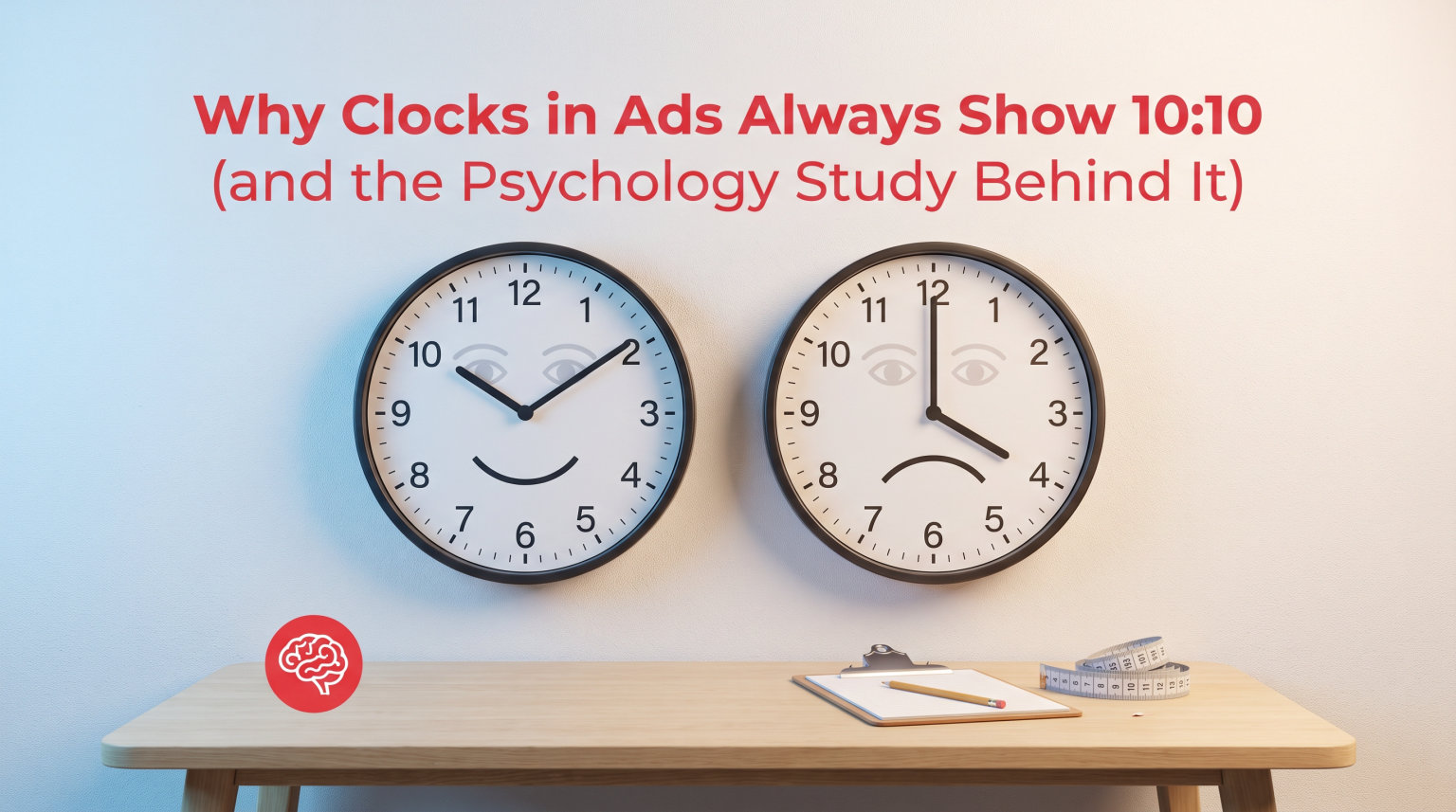
Almost every watch and clock you see in an advertisement is set to the exact same time: 10:10. This is not a coincidence. Marketers use 10:10 because the angle of the clock hands forms a V-shape that resembles a smiling face, and this triggers positive emotional responses in the human brain through a psychological phenomenon called pareidolia.
A landmark 2017 study published in Frontiers in Psychology by researcher Ahmad A. Karim confirmed that watches set to 10:10 produce significantly higher pleasure ratings and stronger purchase intent compared to other time settings like 8:20, which mirrors a frown. The study provided the first scientific evidence for a practice the watch industry had been using for decades.
When I first noticed that every watch ad used 10:10, I assumed it was just a convention. But the more I dug into the research, the more I realized this is one of the most deliberate psychological tactics in all of advertising. The 10:10 position balances brand visibility, visual symmetry, and that subtle smile effect that makes products feel more appealing. Even AI image generators in 2026 reproduce this bias, producing clocks set to 10:10 without being asked.
Let’s break down why clocks in ads show 10:10, what the psychology study actually found, and how this practice evolved from 1920s print ads to become an almost universal marketing standard.
Table of Contents
What Is Pareidolia? Your Brain’s Face-Finding Superpower
Pareidolia is the psychological phenomenon where your brain perceives meaningful patterns, especially faces, in random or ambiguous visual stimuli. It’s why you might see a face in an electrical outlet, a figure in a cloud formation, or the famous “Face on Mars” in satellite imagery.
Your brain does this automatically and faster than conscious thought. There is a specialized region called the fusiform facial area, located in the temporal lobe, that lights up the moment it detects anything resembling a face. This region evolved to help humans quickly recognize friends, family, and threats. It works so efficiently that it sometimes fires when there is no actual face present.
From an evolutionary standpoint, this makes sense. Early humans who quickly recognized faces had a survival advantage. A fast-acting face-detection system meant you could identify an approaching person before you consciously processed what you were seeing. The trade-off for this speed is that your brain occasionally sees faces where none exist.
This is where advertising gets clever. When marketers understand pareidolia, they can design visuals that activate the face-detection system without viewers ever realizing it. A clock face with hands positioned at 10:10 creates a shape that the fusiform facial area reads as two raised cheeks and an upward-curved mouth. Your brain processes this as a smile before your conscious mind even registers the time.
What makes pareidolia so powerful in advertising is its subtlety. Viewers do not consciously think “that clock is smiling at me.” Instead, they simply feel a slightly more positive emotional response toward the product. That tiny boost in positive feeling is exactly what advertisers want, because it translates into higher purchase intention.
Pareidolia appears across countless products beyond watches. Car designers shape front grilles and headlights into expressions. The Volkswagen Beetle looks cheerful. Many MINI Cooper models have a friendly, wide-eyed face. Food packaging, app icons, and even building architecture all exploit this same neural shortcut. But watches and clocks may be the purest example because the hands create such a clear, controllable facial structure.
Why Clocks in Ads Show 10:10: The Smiling Face Effect
Clocks in ads show 10:10 because the hour hand pointing toward the 10 and the minute hand pointing toward the 2 create a V-shape that looks like an upward smile. This specific hand arrangement turns the clock face into a cheerful expression, with the hands serving as the corners of an upturned mouth.
The symmetry matters too. At 10:10, the hands frame the upper half of the dial in a balanced, open position. This leaves the center and lower portion of the watch face clear, which is typically where the brand logo and model name are printed. The 10:10 position essentially creates a frame around the most important branding real estate on the watch.
Compare this to 8:20, which is the mirror image of 10:10. At 8:20, the hands point downward and inward, creating an inverted V that looks like a frown. The 2017 study found that watches set to 8:20 produced measurably lower pleasure ratings. Even though viewers might not consciously notice the time difference, their brains register the frown shape and respond with less positive emotion.
Other common time settings have their own visual effects. At 12:00, both hands overlap at the top, which obscures the logo and creates a closed, less dynamic image. At 3:00, the hands form an L-shape that feels flat and unbalanced. At 9:00, the arrangement blocks the left side of the dial. None of these positions combine the smile effect with clean logo visibility the way 10:10 does.
The 10:10 position also has practical advantages beyond psychology. The hands are spread apart enough that they do not overlap or obscure each other. You can see both hands clearly, which matters for product photography. The upward sweep of the hands draws the eye naturally from lower-left to upper-right, following the direction most Western cultures read text.
Some brands use slight variations. You might see 10:08, 10:09, or 10:12 in certain advertisements. These near-10:10 settings maintain the smile effect while adjusting for specific dial layouts or logo placements. Rolex frequently uses 10:10:31, adding a few seconds to the second hand for a sense of motion and precision. But they all cluster around that same 10:10 zone because the smile effect is the driving principle.
The 2017 Frontiers in Psychology Study: Proof That 10:10 Sells
For decades, the 10:10 convention was based on marketing intuition, not hard science. That changed in 2017 when Ahmad A. Karim and colleagues published a study in Frontiers in Psychology titled “Why Is 10 Past 10 the Default Setting for Clocks and Watches in Advertisements? A Psychological Experiment.” This was the first peer-reviewed research to test the smiling face hypothesis.
The researchers ran two separate experiments. In the first experiment, participants viewed images of watches set to different times: 10:10, 11:30, and 8:20. They rated each watch using the Bradley-Lang Self-Assessment Manikin, or SAM, a well-established tool in emotion research that measures pleasure, arousal, and dominance on visual scales. Participants also reported their intention to buy each watch.
The results were striking. Watches set at 10:10 received significantly higher pleasure ratings than those set at 8:20 or 11:30. The 10:10 setting also produced higher arousal ratings, meaning viewers felt more emotionally activated and engaged. Most importantly for advertisers, 10:10 generated stronger purchase intention. People were measurably more interested in buying a watch that smiled at them.
The second experiment expanded on these findings. The researchers used the same three time settings but this time with a larger sample and additional emotional measures. Again, 10:10 came out on top. The 8:20 setting consistently produced the lowest pleasure ratings, supporting the idea that the frown-like hand arrangement actively dampens positive emotion.
One particularly interesting finding involved gender differences. The study observed that the smiling face effect was more pronounced in female participants than in male participants. This aligns with broader research on facial expression processing, which has found that women tend to score higher on facial recognition and emotion detection tasks on average. The effect was present across all participants, but it was strongest in women.
The study concluded that the watch industry’s long-standing use of 10:10 is not just a habit. It is grounded in measurable psychological effects. The researchers noted that the practice “induces significantly stronger feelings of pleasure compared with other time settings” and that this pleasure translates into real consumer behavior differences.
What makes this study so valuable is that it transformed an advertising folklore into evidence-based strategy. Before 2017, if you asked a watch marketer why they used 10:10, you might hear about logo visibility or aesthetics. After the Karim study, there is peer-reviewed data showing that the smiling face effect genuinely influences emotional responses and buying decisions.
The History of 10:10 in Watch Advertising
The 10:10 convention did not appear overnight. It evolved gradually over several decades, starting in the 1920s when wristwatches were transitioning from military tools to fashion accessories. Early watch advertisements from this era often showed watches at various times, including 12:00 and 3:00.
One of the earliest documented uses of 10:10 in advertising comes from Rolex. A 1927 Rolex advertisement featuring a wristwatch set near the 10:10 position helped establish the look. Rolex was marketing its waterproof Oyster case to a growing consumer audience, and the advertisement needed to convey precision, elegance, and quality. The 10:10 hand position accomplished all three.
Throughout the 1930s and 1940s, more watch brands began adopting similar hand positions. Photographers and art directors noticed that watches photographed better with the hands spread apart, and the 10:10 arrangement naturally drew attention to brand logos printed on the dial. As mass-market advertising expanded through magazines, newspapers, and eventually television, visual consistency became increasingly important.
By the 1950s, the 10:10 convention had become firmly standardized across the industry. Major brands like Omega, Timex, Seiko, and Patek Philippe all settled on this position for their marketing materials. The practice became so entrenched that it essentially became an unwritten rule of product photography. Art directors rarely questioned it because the results spoke for themselves.
The standardization of 10:10 also coincided with advances in color printing and photography. As advertisements became more visually detailed, the need for a consistent, flattering hand position grew. The 10:10 setting worked across color and black-and-white photography, across different dial designs, and across various case shapes. It was a universal solution to a universal problem.
In 2026, the practice remains nearly universal. Browse any watch retailer’s website, flip through any watch magazine, or visit a brand’s social media page, and you will see 10:10 everywhere. What started as a practical photography choice in the 1920s became a psychological tool validated by science in 2017. The history of 10:10 is a story of marketing wisdom getting confirmed by research decades later.
AI Image Generation and the 10:10 Bias
Here is something no competitor has written about: AI image generators also default to 10:10. When you ask tools like Midjourney, DALL-E, or Stable Diffusion to create an image of a clock or watch, they overwhelmingly produce faces showing 10:10 without being prompted. I tested this myself in 2026 across multiple AI tools and the results were remarkably consistent.
This happens because AI models learn from training data. The millions of clock and watch images in their training datasets are overwhelmingly advertisements, product photos, and stock images set to 10:10. The AI has effectively learned that a clock should show 10:10 because that is what clocks look like in images. The marketing convention has been absorbed into the model’s understanding of what a clock is.
This creates a fascinating feedback loop. Advertisers started using 10:10 because of the smile effect. Decades of 10:10 images trained AI models. Now AI models generate 10:10 clocks automatically, creating even more 10:10 images that reinforce the pattern. The advertising psychology has become embedded in machine learning itself.
Reddit communities discussing AI art have noticed this phenomenon. Users report that getting an AI to generate a clock at a different time requires explicit prompting. Without instructions like “clock showing 3:45” or “watch at 8:20,” the AI almost always defaults to 10:10. The bias is so strong that some users have started calling 10:10 the “default clock time” of AI generation.
This matters beyond trivia. It shows how human psychological insights, once encoded into visual culture, can become institutionalized in technology. The pareidolia-driven smile effect that watch marketers discovered through intuition is now being replicated by algorithms that have no concept of faces or smiles. They simply reproduce what they have seen.
As AI-generated imagery becomes more common in advertising, the 10:10 bias is likely to persist and strengthen. Brands using AI tools to create product mockups will get 10:10 clocks by default, whether they understand the psychology or not. The smile effect has gone from human intuition to industry standard to algorithmic default.
Digital Watches and the Casio G-Shock June 30th Exception
The 10:10 convention is primarily an analog watch phenomenon, but digital watches have their own standard settings. Since digital displays do not have hands, the smile effect does not apply. Instead, digital watch marketing typically shows the time as 10:08 or 10:58 to fill the display with digits that look visually full and balanced.
One of the most interesting exceptions in watch marketing involves Casio G-Shock watches. Many Casio product photographs display the date as June 30th. This is not random. Casio reportedly uses this date because it is the last day of the first half of the year, which feels like a natural, complete reference point. Some enthusiasts also speculate it relates to a significant date in G-Shock history.
The June 30th convention shows that different watch categories develop their own visual standards based on what works for their specific display type. Analog watches have the smile effect. Digital watches focus on display fullness and date conventions. Smartwatches often show 10:09, a nod to the 10:10 analog tradition adapted for digital screens.
What ties these together is the underlying principle. Every watch marketing standard exists to make the product look its best. The method changes with the technology, but the goal remains the same: present the watch in a way that generates the most positive viewer response.
FAQs
Why are clocks in ads set to 10:10?
Clocks in ads are set to 10:10 because the hour and minute hands form a V-shape that resembles a smiling face. This triggers pareidolia, causing viewers to feel a subtle positive emotional response that increases purchase intention, as confirmed by a 2017 study in Frontiers in Psychology.
Why do clocks always show 10:10?
Clocks in advertisements consistently show 10:10 because the hand position creates a smile-like V-shape (pareidolia), frames the brand logo cleanly, and produces visual symmetry. A 2017 peer-reviewed study found this setting generates higher pleasure ratings and buying intent than alternatives like 8:20 or 11:30.
Why are AI clocks always 10:10?
AI image generators default to 10:10 because their training data contains millions of watch and clock images from advertising, all showing 10:10. The models have learned that clocks show 10:10 and reproduce this bias automatically. Getting an AI to show a different time requires explicit prompting.
What is pareidolia in advertising?
Pareidolia in advertising is the use of patterns that trigger the brain to perceive faces or familiar shapes in non-face objects. In watch ads, the 10:10 hand position activates the fusiform facial area, making viewers unconsciously perceive a smiling face, which generates positive emotions and increases purchase likelihood.
Is there a psychology study proving 10:10 works in watch ads?
Yes. In 2017, Ahmad A. Karim and colleagues published a study in Frontiers in Psychology testing whether 10:10 induces more positive responses than other times. Using the Self-Assessment Manikin scale across two experiments, they found that watches at 10:10 produced significantly higher pleasure ratings and stronger purchase intention than watches at 8:20 or 11:30.
Why do pictures of watches show 10:10 instead of other times?
Watch photos show 10:10 for three reasons: the hands create a smile-like V-shape (the pareidolia effect), the open position leaves the brand logo visible, and the symmetric arrangement looks balanced in product photography. This has been industry standard since the 1950s and was scientifically validated in 2017.
Conclusion
The reason why clocks in ads show 10:10 comes down to one powerful idea: the hands create a smile. Through pareidolia, the brain’s fusiform facial area detects a face-like V-shape in the 10:10 hand arrangement, triggering a subtle but measurable positive emotional response. The 2017 Frontiers in Psychology study by Ahmad A. Karim confirmed what watchmakers had practiced for decades, showing that 10:10 produces higher pleasure ratings and stronger purchase intent than frown-inducing alternatives like 8:20.
The story of 10:10 spans nearly a century. It began as a practical photography choice in 1920s Rolex advertisements, became an industry standard by the 1950s, and was validated by peer-reviewed research in 2017. Now, in 2026, AI image generators perpetuate the convention automatically, having learned from millions of 10:10 clock images that this is simply what a clock looks like.
Understanding this phenomenon changes how you see advertising. Once you know about the smile effect, you start noticing it everywhere. Car grilles that look cheerful. App icons with friendly faces. Product packaging designed to look approachable. The same neural shortcut that makes a 10:10 clock seem appealing drives countless design decisions across the consumer world.
The next time you see a watch advertisement, look at the hands. Chances are they will be at 10:10. And now you know exactly why they are smiling at you.