
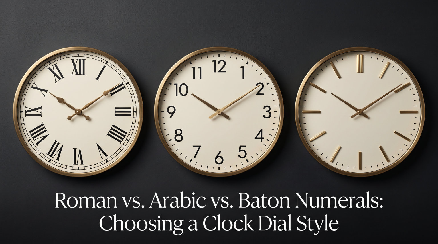
Choosing the right numeral style is one of the first decisions you’ll make when selecting or designing an analog clock. The three most common clock dial numeral styles are Roman numerals, Arabic numerals, and baton indexes, and each one shapes both how quickly you can read the time and how the clock fits into its surroundings.
I’ve spent years around clocks of every kind, from antique grandfather pieces to modern minimalist wall clocks, and the numeral choice often matters more than people expect. A formal drawing room, a busy office, a child’s bedroom, and a sunlit garden each call for a different approach. In this guide, I’ll walk you through the strengths and weaknesses of each style so you can pick the right one with confidence.
Table of Contents
Roman Numerals on Clock Dials: Heritage and Formality
Roman numerals on a clock dial are a centuries-old tradition rooted in European clockmaking. The standard layout uses I, II, III, IIII, V, VI, VII, VIII, IX, X, XI, and XII to mark each of the twelve hours. You’ll see this style most often on antique grandfather clocks, mantel clocks, carriage clocks, and dress watches meant for formal settings.
The visual character of Roman numerals is unmistakable. They feel classical, restrained, and slightly ceremonial. For a study, library, or formal sitting room, they reinforce an air of tradition that few other dial elements can match. Many collectors consider Roman numeral clocks to be the most “clock-like” of all the options, because the layout has barely changed since the earliest tower clocks of the late Middle Ages.
The first mechanical clocks to display Roman numerals emerged in European churches and town halls during the fourteenth century, and the style has been associated with prestige ever since. Tower clocks, Big Ben in London, and most public clocks in historic city centers use Roman numerals for that reason. When you install a Roman numeral clock in your home, you’re echoing a design tradition that stretches back nearly seven hundred years.
Why Most Clocks Use IIII Instead of IV
One of the most common questions about Roman numeral clocks is why the four o’clock position almost always reads “IIII” rather than the historically correct “IV.” Several theories exist, and none has been definitively proven. The most widely cited explanation is visual symmetry: using IIII creates a balanced pattern with VIII on the opposite side of the dial, since both positions then have four characters.
Practical reasons also support the convention. “IIII” is easier to read at a glance because every numeral on the dial has a fixed character count pattern of one, two, three, or four letters. It also historically helped clockmakers who were paid by the number of characters they cast. Some historians point to a royal preference, claiming that King Louis XIV of France favored IIII because it honored his name in a subtle way.
Religious and symbolic reasons have also been suggested. IIII was sometimes read as a reference to the four evangelists or the four cardinal virtues. Whichever story you believe, the IIII convention has been the standard for centuries and is unlikely to change. The few clocks that use IV are usually modern, minimalist, or deliberately non-traditional designs.
Where Roman Numerals Work Best
Roman numerals shine in formal and traditional interiors. They pair naturally with wood panelling, brass hardware, and ornate furniture. They also suit clocks that you want to look like heirlooms, even if they’re newly made.
The drawbacks are real, though. Roman numerals can be harder to read at a distance, and they can appear “try-hard” or fussy in casual or modern settings. Some viewers, particularly children or people unfamiliar with Roman numerals, find them slower to interpret. If you need a clock that must be read instantly across a room, Roman numerals may not be the best choice.
Forum discussions about dial styles often highlight a related point: outdoor clocks with Roman numerals can feel mismatched with the setting. A Roman numeral carriage clock on a garden table, for example, can look slightly out of place against weather-worn furniture. Indoor placement, where the clock is part of a curated interior, is where Roman numerals perform best.
Arabic Numerals on Clock Dials: Readability First
Arabic numerals are the standard 1 through 12 that most of the world uses every day. On a clock dial, they are the most legible option at a glance and the easiest to read at distance, in low light, or for younger viewers. They are the default choice for office clocks, school clocks, kitchen clocks, and most contemporary wall clocks.
The strength of Arabic numerals is purely functional. A trained eye can identify any hour on an Arabic dial in a fraction of a second. There’s no decoding required. This is why you’ll find them on clocks where quick time-reading matters more than decorative appeal, including train stations, classrooms, and hospital corridors.
Modern watchmakers and clock designers often pair Arabic numerals with luminous paint for low-light legibility. The combination of clear numeral shape and glowing material makes Arabic numerals the dominant choice for tool watches, pilot watches, and dive watches. For clocks that must work at night or in low light, Arabic numerals with applied luminous plots are usually the safest bet.
Western vs. Eastern Arabic Numerals
Most clocks use Western Arabic numerals (1, 2, 3, 4), but a separate family called Eastern Arabic numerals exists and is common in many parts of the Middle East and North Africa. Eastern Arabic numerals look quite different from their Western counterparts, with characters such as ١, ٢, ٣, ٤, ٥, ٦, ٧, ٨, ٩, ١٠, ١١, and ١٢ representing one through twelve.
Some clocks feature both systems side by side, called an “Arabic dial” in the watch world. This mixed layout shows both Western and Eastern Arabic numerals in the same design and is popular in collector circles because it honors the linguistic diversity of the regions where the numerals developed. An Arabic dial is a clear nod to heritage while keeping the time fully legible for international audiences.
If you collect clocks from a particular region or want an authentic cultural touch, Eastern Arabic numeral dials are a beautiful option. For general-purpose clocks used in international or Western contexts, Western Arabic numerals remain the practical choice.
Font and Styling Choices
Arabic numerals give clock designers enormous stylistic flexibility. They can appear in sleek sans-serif fonts for modern interiors, in elegant serifs for traditional settings, or in custom typography that turns numbers into a design feature. Bold weights improve legibility; thin weights look refined but can be hard to read at a distance.
Designers can also vary the way numerals are placed on the dial. Some clocks use full Arabic numerals at every hour position. Others use Arabic numerals only at the cardinal positions (12, 3, 6, 9) with baton markers or simple dots at the remaining hours. Still others use a stylized font that mimics handwriting or art deco lettering, giving the clock a distinctive personality.
The risk with Arabic numerals is visual clutter. If the numerals are too large, too thick, or poorly spaced, the dial can feel busy. A well-designed Arabic numeral dial balances clarity with restraint, and that balance is what separates a beautiful clock from a tired one.
Baton Numerals and Indexes: Minimalist Markers
Baton numerals, often called baton indexes or simply markers, are short rectangular or stick-shaped marks placed at each hour position instead of numbers. They come in several variations, including plain batons, dagger indexes, arrow markers, and stick markers. Each variation has its own character, but they share a common purpose: marking the hours without committing to a full numeral system.
Baton markers give a clock a clean, modern look that suits contemporary interiors, Scandinavian design, and minimalist offices. Because they don’t spell out numbers, they rely on the viewer’s familiarity with clock geometry. Most adults can read a baton-only dial instantly, but younger children may need to count the marks.
For designers, batons are the most flexible marker type. They can be printed flat onto the dial, raised as applied indices, or stamped into the metal. They can be slim and elegant, broad and bold, or tapered into geometric shapes. This range of expression is one reason baton markers dominate contemporary clock design, especially in the mid-century modern and Bauhaus-influenced aesthetic.
Types of Baton and Index Markers
Baton markers are not all the same. A plain baton is a simple rectangle. A stick marker is thinner and longer. A dagger index tapers to a point at one end, while an arrow marker has a triangular tip. Some clocks use round dots instead of rectangles, and some use a mix of shapes, with longer markers at 12, 3, 6, and 9 to anchor the dial.
Each style sends a different visual signal. Sharp daggers and arrows feel sporty and tool-oriented, which is why they’re a favorite on dive watches and pilot watches. Plain batons feel modern and architectural. Round dots feel classic and neutral. The choice often comes down to whether you want the clock to feel technical, decorative, or quietly functional.
Applied indices, which are three-dimensional metal pieces affixed to the dial, are typically more expensive than flat-printed markers but add depth and a sense of craftsmanship. Some high-end watches and clocks also inset luminous material into the batons, so the markers glow in the dark. This is a particularly useful feature for bedside clocks or any timepiece that needs to be read at night.
Where Baton Numerals Excel
Baton markers are ideal for minimalist interiors where a numeral-heavy dial would feel intrusive. They work beautifully on large wall clocks where numbers would feel crowded, and they suit modern furniture, gallery walls, and clean-lined office spaces. Many high-end watches and clocks use applied baton markers with luminous plots for nighttime legibility.
The drawback is that baton-only dials assume the viewer can mentally map the markers to hour positions. In a dark room, or for someone unfamiliar with clocks, this can slow reading time by a beat or two. Luminous markers largely solve the dark-room issue, but they add cost.
Compared with Roman and Arabic numerals, baton markers also tend to age better visually. They don’t depend on a specific typeface or numeral system, so they rarely feel dated. A clean baton-marker clock bought today will look just as fresh in fifteen years, while a heavily stylized Arabic dial might feel tied to a particular design era.
Legibility Comparison: Reading Time at a Glance
When it comes to pure legibility, Arabic numerals win almost every test. They are the easiest to read at distance, in poor lighting, and for viewers of all ages. They are also the easiest to read in motion, which is why they dominate clocks in public spaces where glances are brief.
Roman numerals come second in most legibility tests. They are slower to read than Arabic, especially for people unfamiliar with the system, but they remain readable for most adults at normal viewing distances. Baton markers rank third in raw legibility, though luminous baton markers can match Arabic numerals in low-light conditions.
Legibility also depends heavily on the size of the dial and the size of the numerals. A wall clock with six-inch Roman numerals across the room is much easier to read than a small mantel clock with thin Arabic numerals. Always consider the relationship between numeral size, dial size, and viewing distance before choosing a style.
Mixed Numeral Strategies
Many clockmakers solve the legibility-versus-style trade-off by mixing systems. A common approach is to place Arabic numerals only at the 12, 3, 6, and 9 positions, with baton markers or Roman numerals elsewhere. This is sometimes called a partial numeral layout, and it gives the dial a focal point while keeping the rest visually quiet.
Another classic mixed style is the California dial, which combines Roman numerals on the top half of the dial with Arabic numerals on the bottom half. Originally designed for watches used by military pilots who needed quick readability under stress, it is now a popular decorative choice that balances heritage with clarity.
There’s also the explorer-style layout, where Arabic numerals at 3, 6, and 9 are paired with triangular markers at 12 and a mix of batons elsewhere. Each of these mixed strategies emerged for practical reasons, but they’ve all been adopted as design signatures in their own right. Mixing numerals and markers is often the best way to get the best of both worlds.
Factors That Change the Legibility Ranking
Distance, lighting, and viewer experience all matter. At three feet in a well-lit room, all three styles are easy to read. At twenty feet in dim light, Arabic numerals pull ahead quickly. For older viewers or those with reduced vision, bold Arabic numerals are usually the safest choice, while thin Roman numerals can be genuinely difficult.
Children and clock novices tend to find Arabic numerals fastest. Anyone who learned Roman numerals in school usually finds them perfectly readable after a few seconds of adjustment. The lesson is that the “best” numeral style depends on who will be reading the clock and from where.
Color contrast also plays a role in legibility. A black numeral on a white dial is easier to read than a cream numeral on a beige dial, regardless of style. If legibility is the top priority, choose a clock with strong contrast between the dial background and the markers. Many of the most legible clocks pair Arabic numerals with bright, high-contrast color schemes.
Choosing the Right Numeral Style for Your Clock
Start by asking three questions: where will the clock live, who will read it most often, and what feeling do you want the room to have. The answers point clearly toward a numeral style.
For a formal interior such as a study, dining room, or entryway, Roman numerals are usually the best fit. They reinforce traditional décor and signal that the clock is meant to be admired, not just used.
For a busy office, classroom, kitchen, or workshop, Arabic numerals are the practical choice. They keep reading time fast and reduce errors, especially when the clock is viewed from across the room.
For a modern apartment, gallery wall, or minimalist office, baton markers give you the cleanest visual result. They support the architecture of the room rather than competing with it.
Matching Numeral Style to Clock Type
Different clock formats also have natural numeral pairings. Grandfather clocks and mantel clocks traditionally use Roman numerals, often with elaborate chapter rings. Wall clocks for kitchens and offices usually use Arabic numerals. Designer wall clocks and contemporary floor clocks tend toward baton markers or partial numeral layouts.
Outdoor clocks deserve special mention. Roman numerals can look formal and out of place on a garden wall or patio, while Arabic numerals and bold baton markers remain readable in bright sunlight. If the clock is exposed to weather, choose a style with thick, well-painted markers that won’t fade quickly.
Bedside clocks and alarm clocks almost always use Arabic numerals for quick waking reads, while decorative mantel clocks lean toward Roman numerals for atmosphere. Industrial or factory clocks rely on large Arabic numerals for visibility across long distances. The format of the clock itself often narrows the numeral choices before you even consider personal taste.
Practical Tips Before You Buy
Before committing to a numeral style, look at photographs of the clock in a real room, not just the product catalog. Numbers that look elegant in a studio shot can feel overwhelming against a textured wall, and slim Roman numerals that look refined up close may vanish at viewing distance.
If you can, test the clock in person. Stand where it will actually hang, then read the time from that spot. This five-second test reveals more about legibility than any spec sheet. It is also the simplest way to choose between styles when you are stuck.
Finally, consider maintenance. Printed numerals can fade over time, especially in direct sunlight or humid environments. Applied metal markers last longer but may tarnish. Roman numerals, when properly printed or engraved, often outlast printed Arabic numerals simply because the larger character forms are less sensitive to fine detail loss. Choose a construction method that matches the room’s lighting and climate.
Frequently Asked Questions About Clock Dial Numerals
What is the difference between Roman numerals and Arabic numerals on a clock dial?
Roman numerals use letters (I, II, III, IV, V) to mark the hours, while Arabic numerals use the familiar 1, 2, 3 and so on. Roman numerals give a traditional, formal look and are slower to read at a glance, while Arabic numerals are the most legible style and work well in offices, schools, and casual spaces.
Why do some clocks use IIII instead of IV?
Most clocks use IIII at the four o’clock position instead of the historically correct IV for visual symmetry with VIII at the eight o’clock position. Both positions then have four characters, which creates a balanced pattern around the dial. Practical, religious, and historical reasons are also often cited.
What are baton numerals on a clock dial?
Baton numerals, also called baton indexes or hour markers, are short rectangular or stick-shaped marks placed at each hour position instead of numbers. They give clocks a clean, minimalist look and rely on the viewer’s familiarity with clock geometry to read the time.
Which clock dial numeral style is most legible?
Arabic numerals are the most legible clock dial numeral style. They are easiest to read at distance, in low light, and for viewers of all ages. Roman numerals come second, and baton markers rank third unless they include luminous material for low-light visibility.
Do clocks still use Roman numerals today?
Yes. Roman numerals are still common on formal mantel clocks, antique grandfather clocks, carriage clocks, and dress watches. They remain popular because they convey tradition and craftsmanship, even though Arabic numerals and baton markers are more common on everyday wall clocks.
Conclusion: Matching Numeral Style to Your Clock’s Purpose
Roman, Arabic, and baton numerals each bring something different to a clock dial. Roman numerals offer heritage and formality, Arabic numerals deliver unmatched legibility, and baton markers provide modern minimalism. The right choice comes down to where the clock will live, who will read it, and what feeling you want the room to carry.
Take a few minutes to stand in the actual space where the clock will hang, picture each numeral style against the wall, and pick the one that feels both readable and right for the room. That single decision will shape how the clock looks and how often you actually enjoy reading it for years to come.